Discover what it takes to sail through data
like a pro with a KPI dashboard.
Are dashboards dead? As the data needs of modern users evolve, the traditional role of dashboards in Business Intelligence (BI) is being questioned. Some have boldly declared dashboards obsolete. But is this really the case?
Sure, dashboards may be limited in terms of complexity and rather rigid. Once created, they cannot easily be customized or changed. This makes it difficult to keep them up-to-date and accurate as your data changes over time. And as the amount of data increases, so makes the effort required to maintain and update their accuracy.
While dashboards are no longer the sole means of communicating key data to businesses, their decline is not the end of their usefulness. Instead, it marks the onset of a new era in analytics solutions. Today, businesses recognize that dashboards are not a ‘one size fits all’ solution. Newer analytics features are emerging, easily adopted alongside dashboards, to better meet the evolving BI needs of regular business users. The rise of exciting technologies, such as automated analytics, augmented technologies and contextualized insights, has democratized data analysis and opened up new data-led opportunities. Many of these technologies do not require advanced technical expertise or know-how.
So, should you build a great KPI dashboard today? The answer is still yes – if you keep these 7 key traits in mind when building or updating your next dashboard.
7 elements of a powerful KPI dashboard
Clarity is key
KPI dashboards should be crystal clear, stripping away the unnecessary noise and presenting information in a way that’s easy to understand at a glance. Whether it’s sales figures, website traffic, or customer satisfaction scores, clarity ensures that everyone from the CEO to the intern can quickly grasp what’s going on and make informed decisions. When crafting your KPI dashboard, remember: clarity isn’t just important – it’s essential.
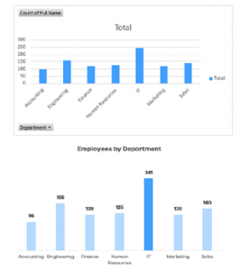
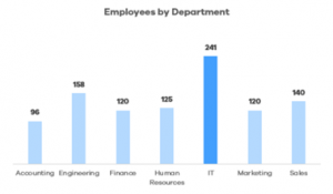
Here is an example of design good practices where most important data stands out and noise is reduced to its minimal to only show relevant information.

What to do: Avoid clutter, keep it simple, use appropriate charts (line chart for time trends vs bar charts for comparison) and spotlight the most relevant data to tell the story clearly and easily. It is also possible to use AI to summarize the main conclusions in a short text, so that users don’t have to scroll through the entire dashboard.
Relevant metrics only
Don’t clutter your dashboard with every metric under the sun. That could be tempting, but too much data analytics can be overwhelming and counterproductive. Instead, focus on the metrics that really matter – the ones that directly tie into your business goals and objectives.
What to do: Choose the metrics appropriate to your audience and to the story you want to convey; a dashboard for financial area will show different metrics than for production, sales or maintenance.
Real-time updates
In a fast-paced world, yesterday’s data might as well be ancient history. That’s why it’s crucial for your dashboard to provide real-time updates, giving you a constant finger on the pulse of your business. Whether you’re tracking daily sales targets, monitoring social media engagement, or keeping an eye on website traffic, real-time updates ensure that you’re always in the know, keeping you agile and responsive.
What to do: There’s no doubt about it: Business intelligence (BI) is quickly moving to the top of the priority list for organizations across the world. It started off as a niche but has quickly become the norm for even small-time companies. Here are the best 10 business intelligence tools to help your business excel.
Make dashboards customizable
One size does not fit all when it comes to KPI dashboards. Your marketing team has different priorities than your finance department, and that’s okay. A great dashboard allows for customization, letting each user tailor the view to their specific needs – to visual thinkers who love pie charts or numbers person who prefers bar graphs.
What to do: choose dashboard systems that allow for customisation such as rearrangeable widgets, and picking or filtering which metrics to display and different time frames. In Excel, Pivot Charts is a great option to let your users play with the data using filters, slicers and timelines.
Actionable insights
A KPI dashboard shouldn’t just state data – even if looks great. It should serve up actionable insights on a silver platter. Highlight trends, identify outliers, and flag areas that need attention. Think of it as your business’s personal detective, spotting emerging trends, identifying areas for improvement, or seizing new opportunities within the data.

What to do: when crafting your dashboard, remember it’s not just about the data – it’s about unearthing the insights that lie beneath the surface.
Mobile-friendly design
Let’s face it, we’re all glued to our phones these days, and being tied to a desktop just isn’t practical. A great KPI dashboard is mobile-friendly, allowing you to keep tabs on your business even when you’re on the go. Whether you’re waiting for your morning coffee or lounging on the beach, access to critical data should always be just a tap away.
What to do:The Salesforce mobile application is fully customizable according to your users’ needs, allowing you to access your dashboards from anywhere.
User-friendly interface
What does user-friendly actually mean? For a KPI dashboard, it probably means that the least tech-savvy person in your organization can access, interact, understand and act on the information displayed. Remember, the goal is to empower users, not confuse them. So, when crafting your dashboard, always keep the end user in mind and strive to create an experience that’s as delightful as it is informative.
What to do: Keep it organized, label everything clearly, and provide tooltips or explanations where needed.
How we helped Tupperware build a great KPI dashboard
Tupperware teamed up with Near Partner to up its application maintenance game. We took over 12 of Tupperware’s crucial applications, used globally by hundreds of users. These applications are vital to Tupperware’s supply chain, production planning and sales analysis.
Tupperware’s maintenance is split into two parts: service requests and incidents. Incidents, like bugs, get top priority, while service requests cover smaller fixes and improvements.
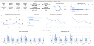
Here’s the general dashboard:

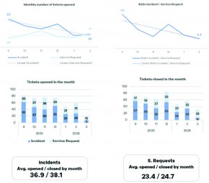
Now take a look at some specific widgets:
Number of incidents and service requests: We track how many issues pop up and how many get fixed each month and week.

Resolution time: Incidents get top priority, so they should be resolved quicker than service requests.

Status of open tickets: We monitor where each ticket stands in the resolution process, from open to resolved.

Aging time: Tickets get sorted by how long they’ve been open. The goal aim to clear them out of the older buckets ASAP.
Priority levels: We prioritize incidents based on their urgency, tackling the critical ones first.
Top locations, users, and ticket categories: This helps to see where the most support is needed, and which areas might need extra attention.
Near Partner, crafting your perfect KPI dashboard together
While some may argue that dashboards are becoming obsolete in the face of evolving data needs and emerging analytics solutions, it’s clear that they still hold significant value. Dashboards are not dead; however, they do require updating and adaptation to meet the changing demands of modern users. By embracing newer analytics features and technologies alongside dashboards, businesses can ensure they remain relevant and effective tools for informed decision-making. Thus, rather than being replaced entirely, dashboards are undergoing a transformation to better serve the evolving BI landscape. Parte superior do formulárioParte inferior do formulário
As experts in developing tailored software solutions, we can help you design a KPI dashboard that’s as unique as your business. From seamless integration to intuitive design, Near Partner leaves no stone unturned in ensuring that your dashboard not only meets but exceeds your expectations. Reach out and unlock the full potential of your data-driven journey.


